Packaging ideas, I’m guessing you probably didn’t expect a post like this popping up. But I fell into a rabbit hole of research the other day and now we’ve got a post based around an element of consumerism that I truly love. Think of it as more as an inspirational post (if you’re in the consumer experience game) then a be-all about packaging.
Packaging is one of the last steps (before using the actual product you’ve bought) to touch the consumer, to create excitement or deliver some level of delight. It’s the spot that rounds out their purchase journey and an area that can make or break you as a brand. Seriously, it can.
So I’ve broken this down in four different packaging areas – Sneakers, Apparel, Tech-based and Environmental. Sneakers because I’m a fan and some of the best packaging concepts I’ve seen, have come from sneaker collaborations. Apparel, because most of what we speak about here, and the industry we’re in, is primarily apparel based and generally sucks at packaging (hello, inspiration!). Tech as I’m a super nerd in the area and tech brands generally seem to solve that function/aesthetic problem better than most. And finally, Environmental because this is an area everyone should be becoming more conscious of when developing future packaging concepts (down to the plastic products ship in).
No doubt there’s a lot I haven’t covered, have missed, and am probably not educated enough in. With that in mind, if you want to add to the conversation, hit me at hellomate at empire ave dot com and we can play conversational tennis. Beyond that, onwards to the gallery of packaging images/concepts we’ve pulled together from spending too much time on the google.
Packaging Ideas - Sneakers
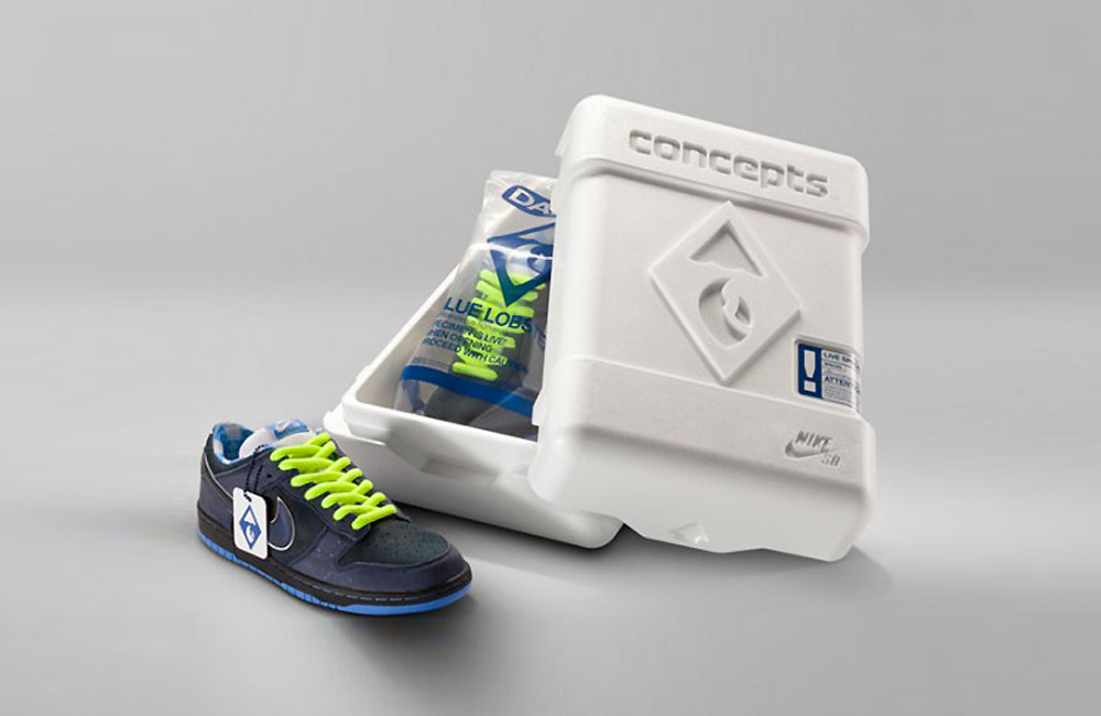
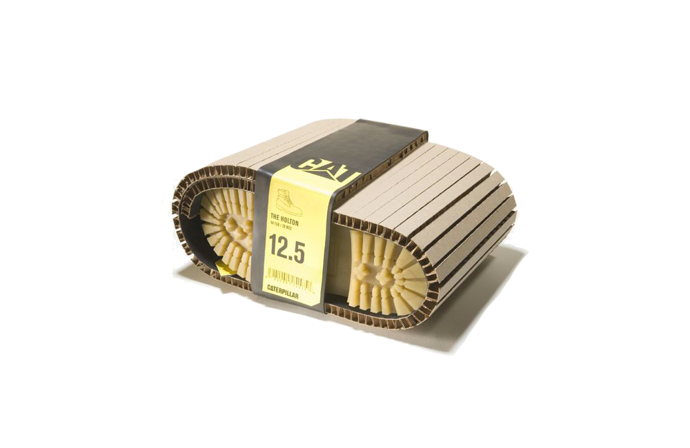
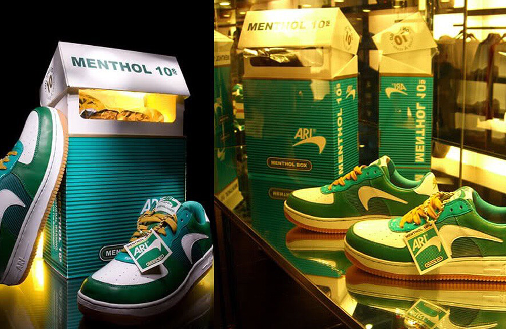
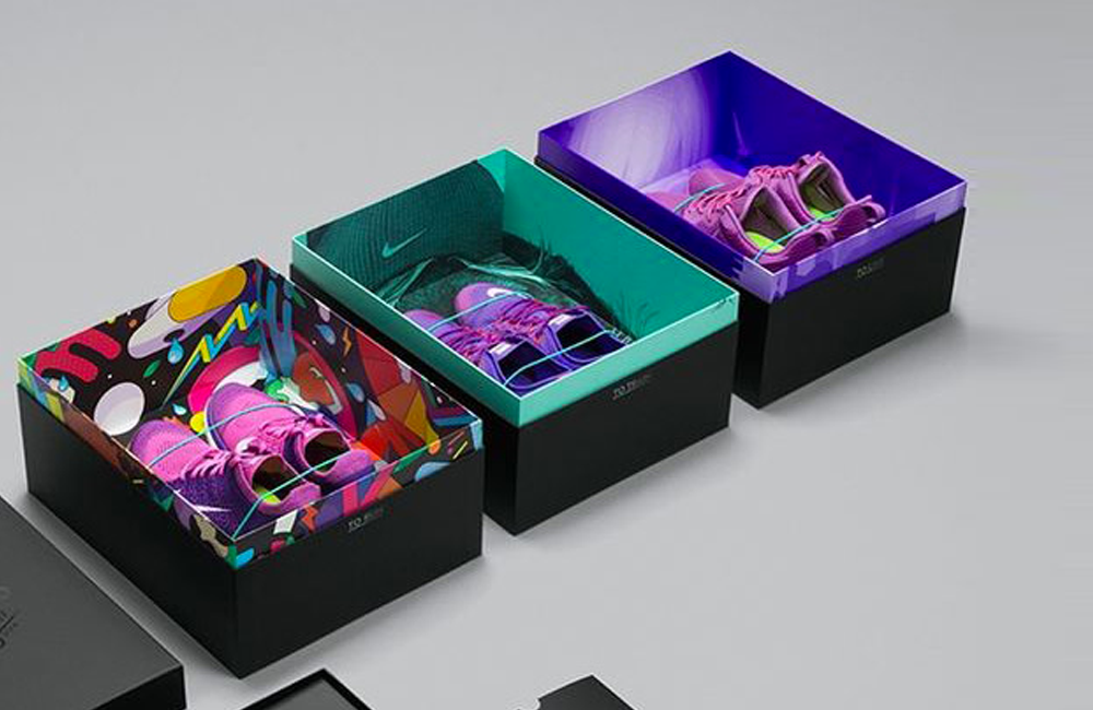
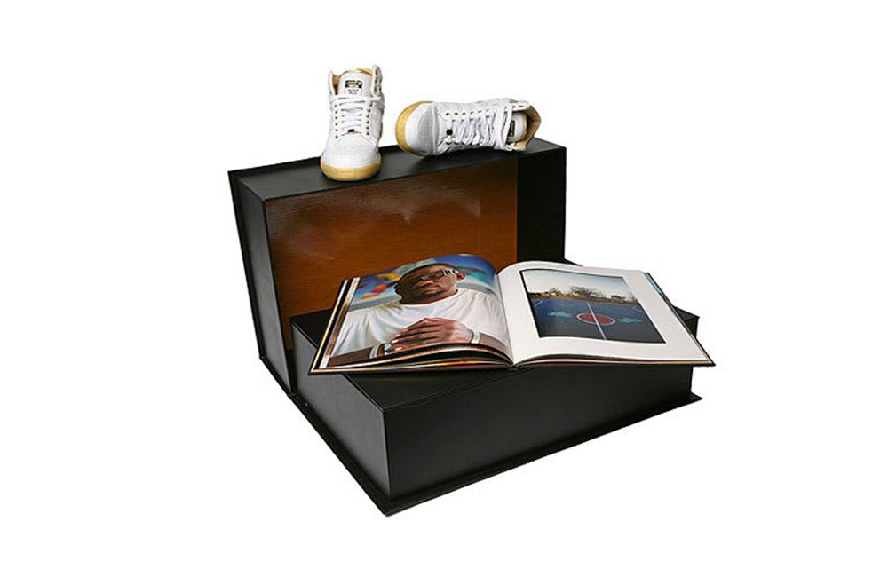
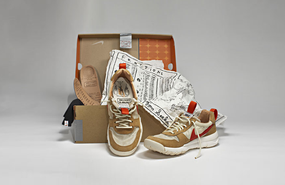
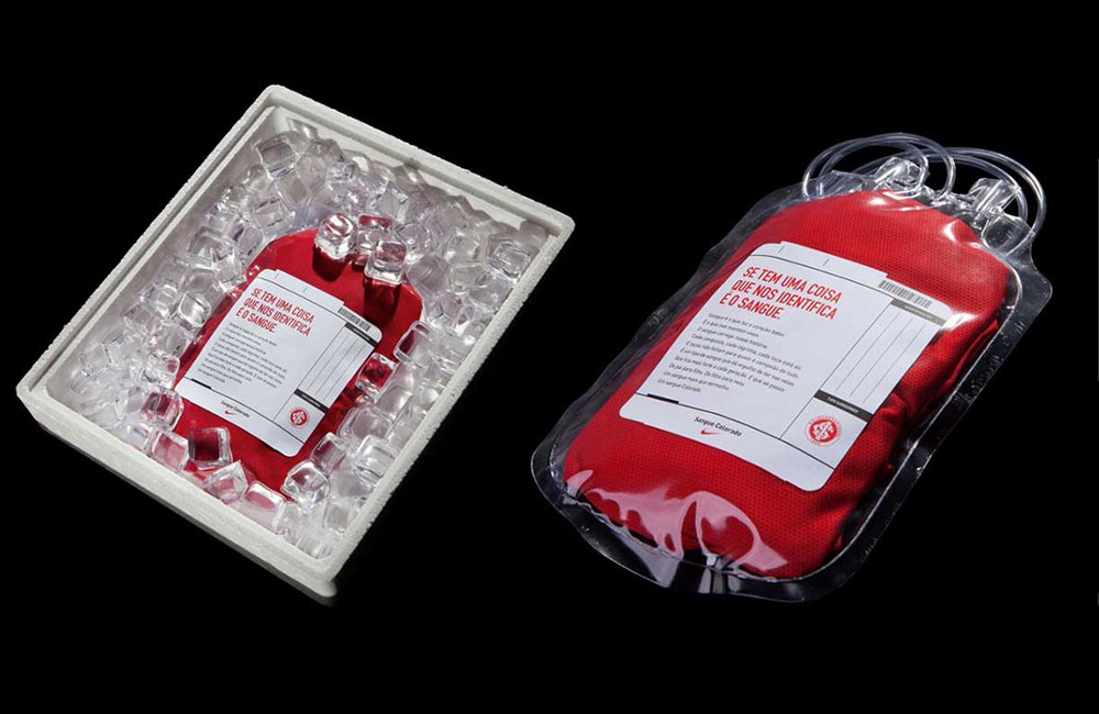
From the wildly successful Lobster Themed Series from Concepts (retailer out of Boston) to the ever-changing concepts from both Nike and adidas, sneakers are the area where I’ve probably seen the most creative packaging concepts hit.
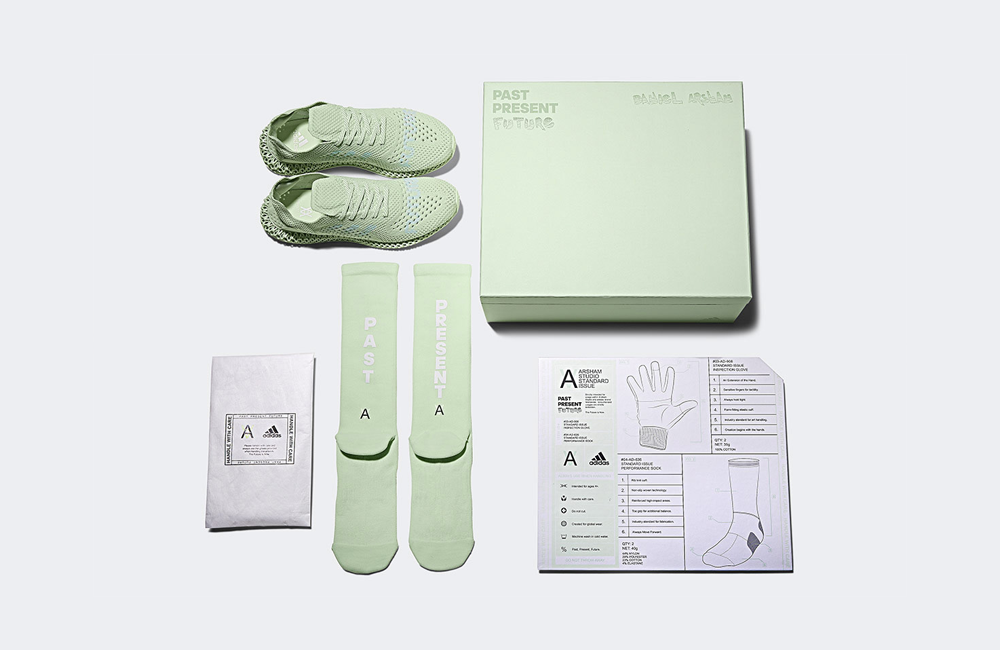
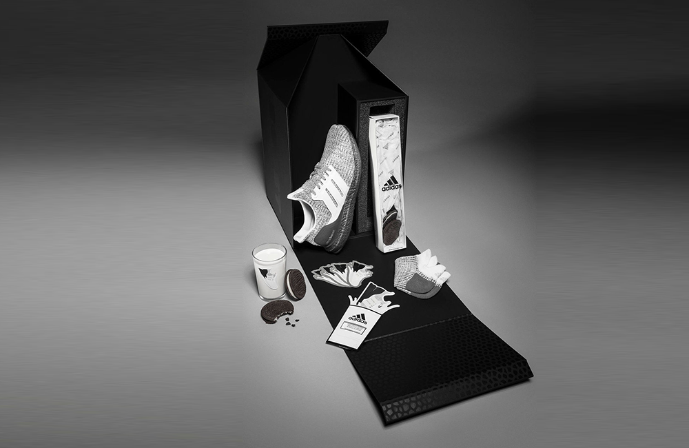
Concepts have always nailed their packaging ideas, and experience when dropping specialty sneakers. Here’s a run-down on their Lobsters, and then also, their overall run with collaborations (worth a read). The thing with sneaker packaging is you have a lot more room to roam, from decorating the shoe box to including it as a larger part of a packaging project (like adidas did, here).
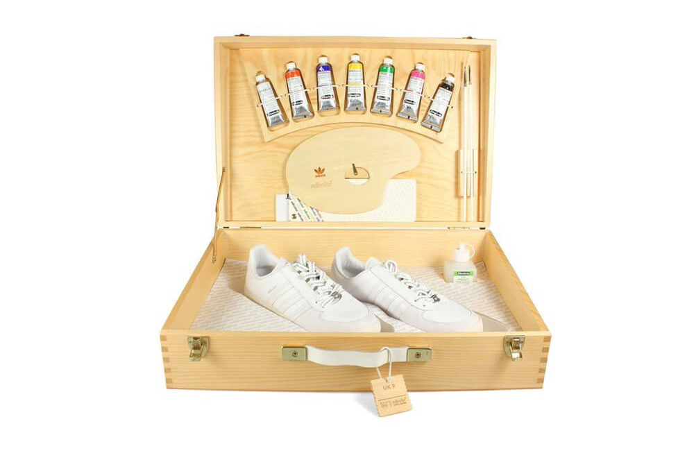
Some of the packaging ideas or executions you see with sneakers might seem out of reach, or too much, but it’s easy enough to take ideas from what you see with sneakers/shoes and apply it to the industry/area you’re playing around. For example, the adicolor box that came with paints and a pair of white kicks, I remember Billabong did some trunks a while back that you could paint and maybe Rip Curl did something similar to. Either way, plenty to play around with to create some fun experiences.
Packaging Ideas - Apparel
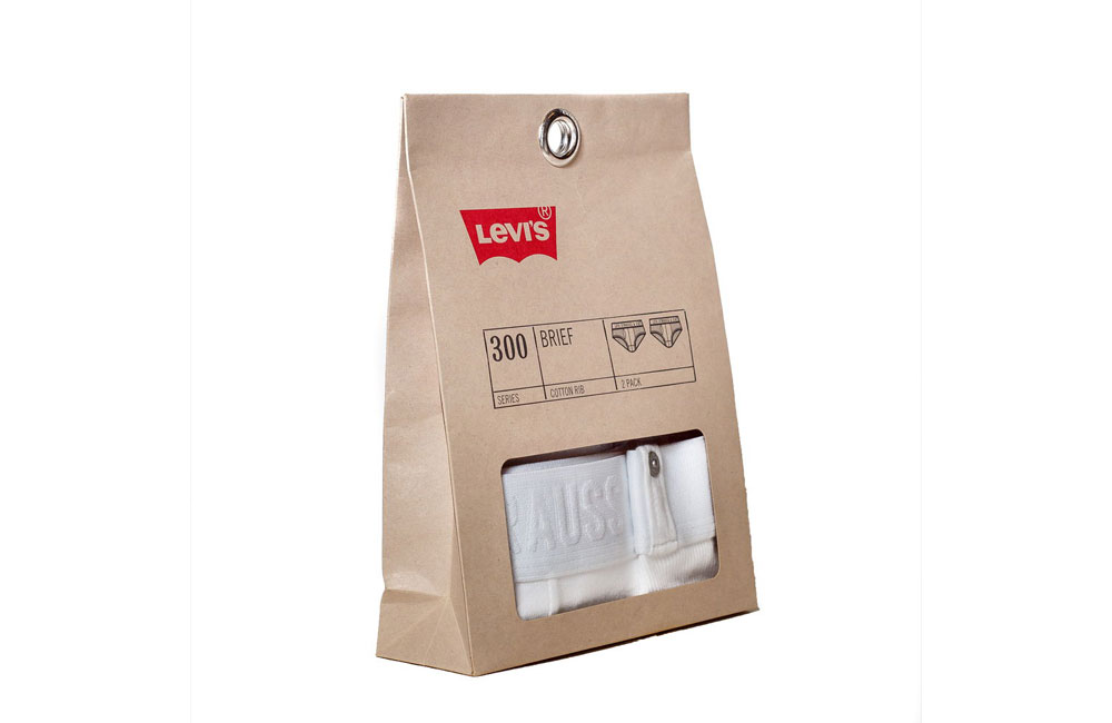
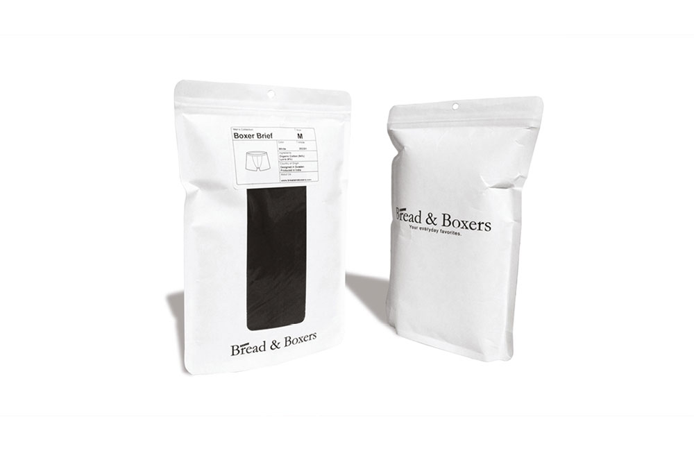
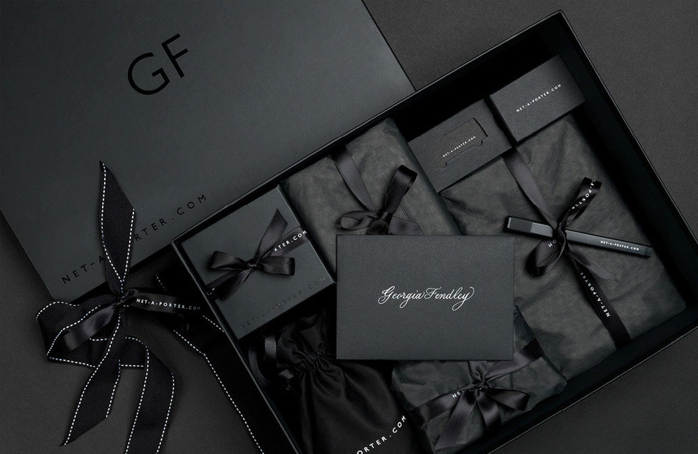
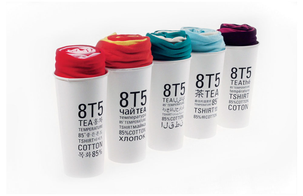
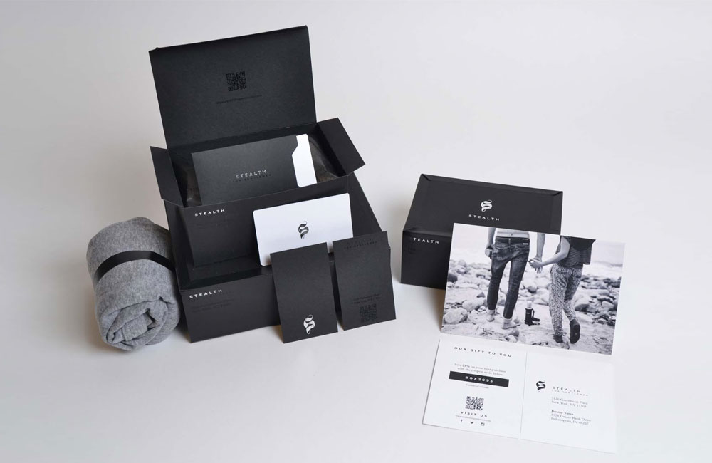
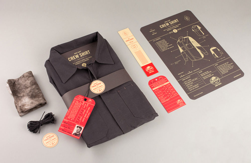
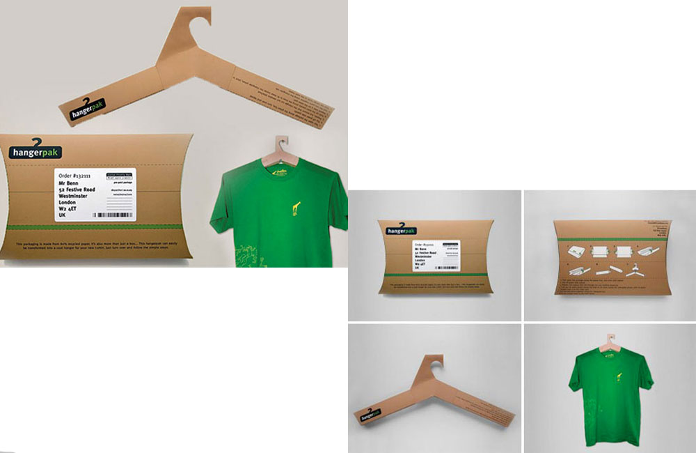
Packaging for apparel is probably one of the harder product categories to cater for. You either see something wildly over the top, or you see something simple (nicely wrapped in tissue paper, etc). So when you see something mildly interesting you take notice.
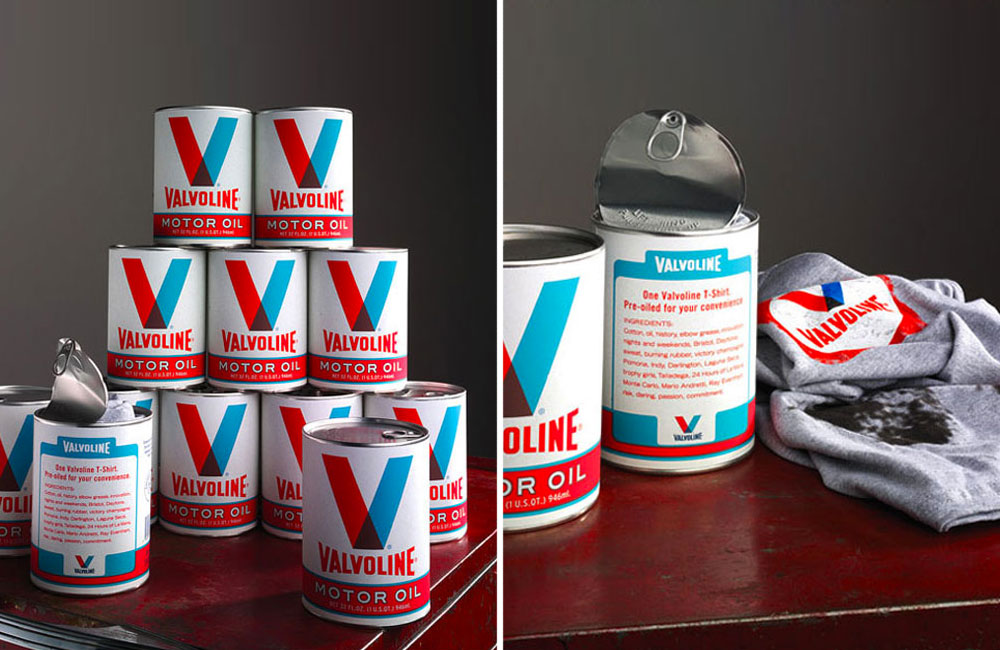
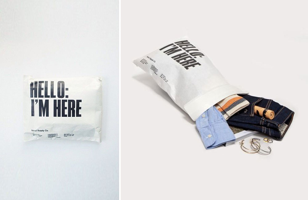
Need Supply with their e-commerce packaging is a win, a simple print on the outside sparks conversation and what would normally become trash becomes a social object for a minute or so. Another win is Valvoline taking their traditional oil can and stuffing a tee in there, that was neat.
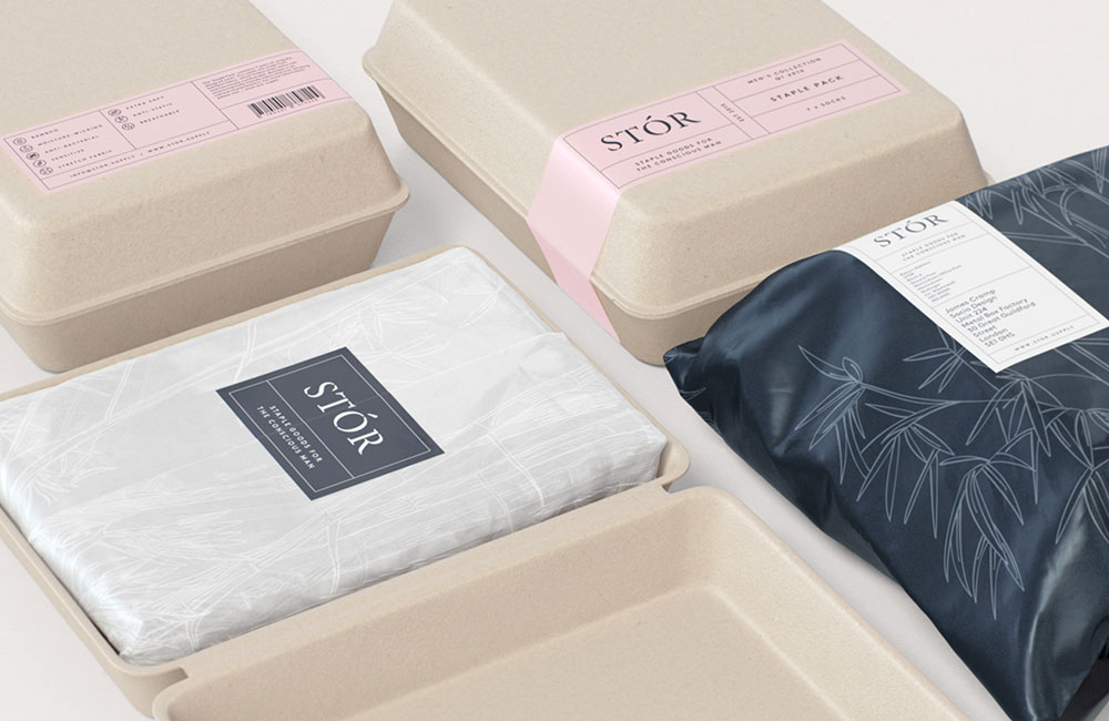
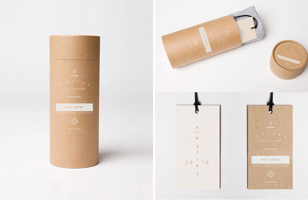
There’s plenty of options out there to do something interesting, you’re probably better waiting until you have something worth putting the extra effort into – limited edition, etc. Otherwise just run down the tissue paper wrapper nicely in paper or similar, like Mutiny or Stor.
Packaging Ideas - Tech-Based Products
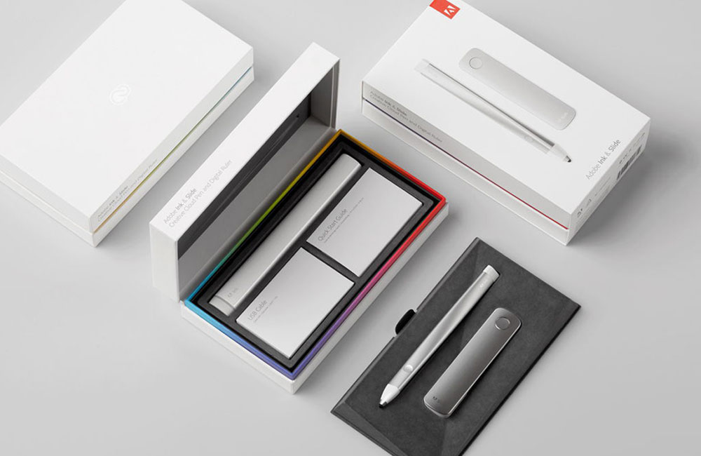
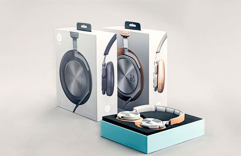
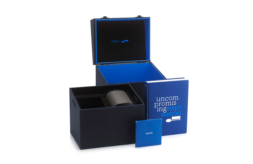
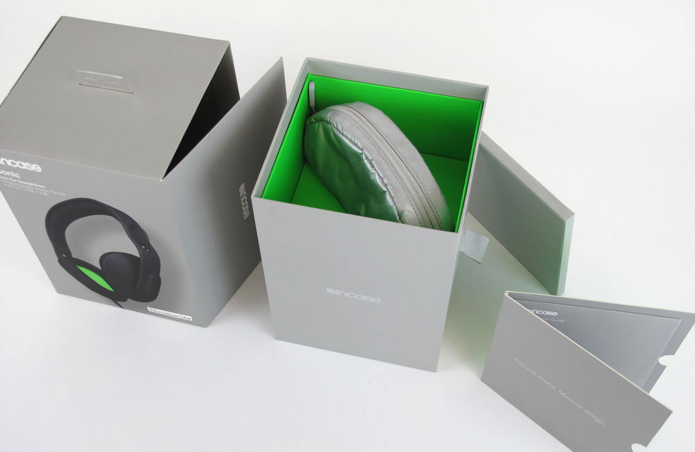
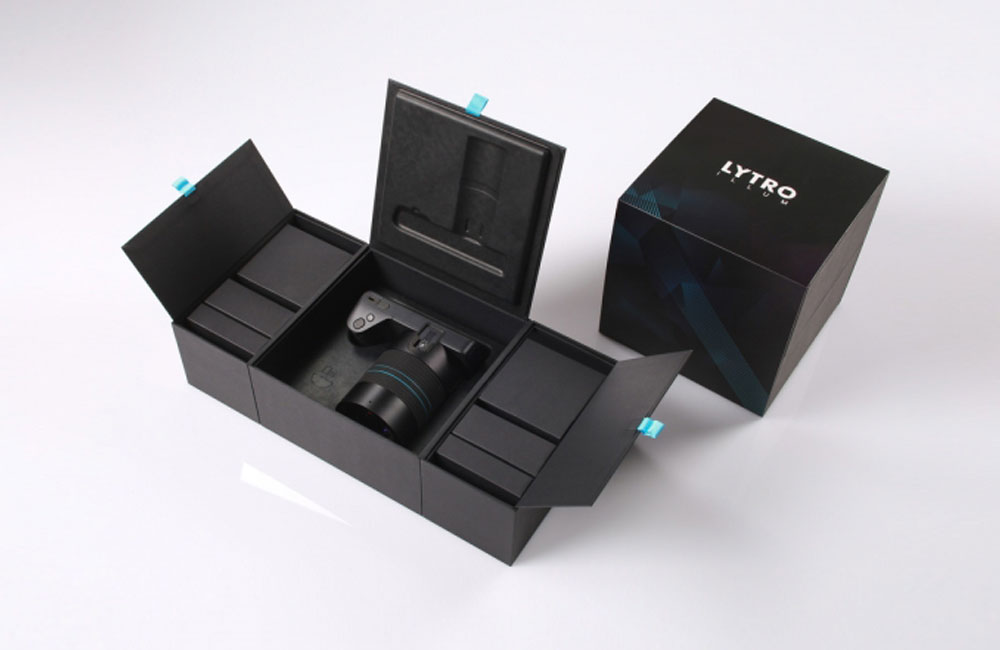
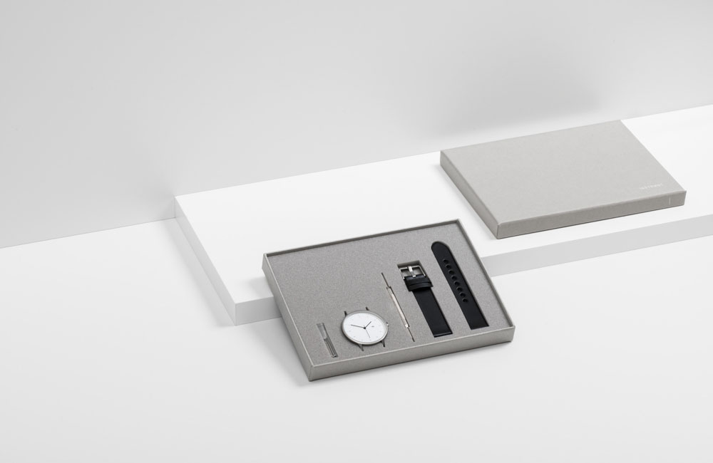
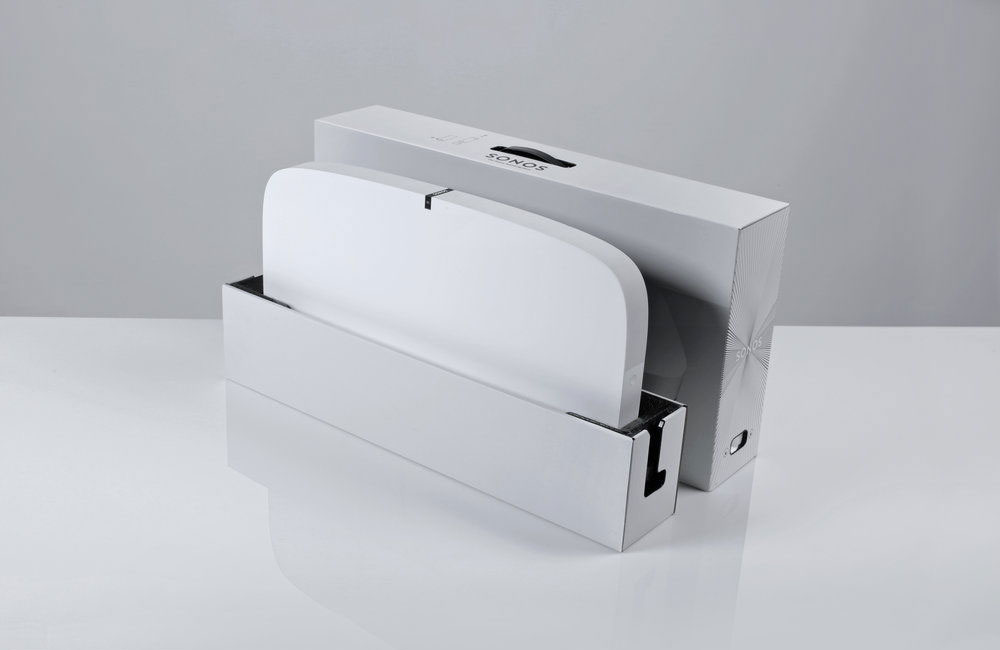
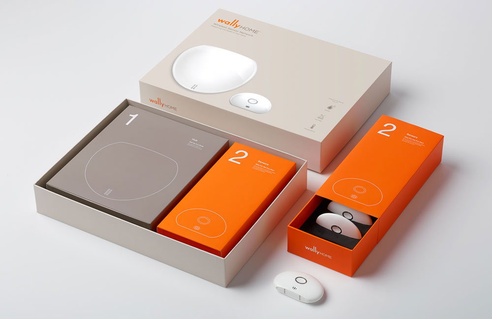
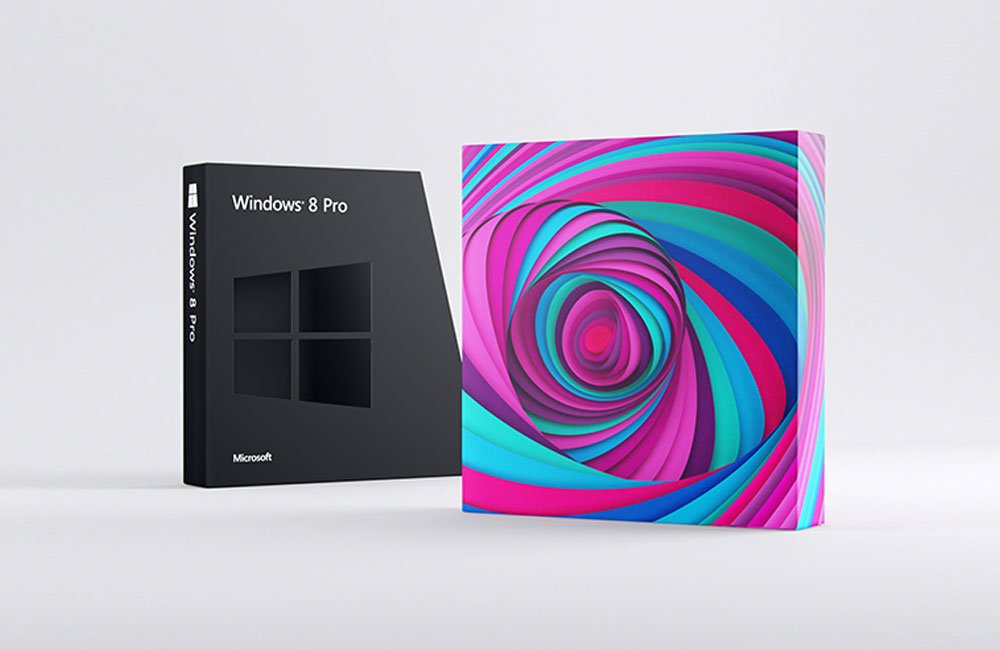
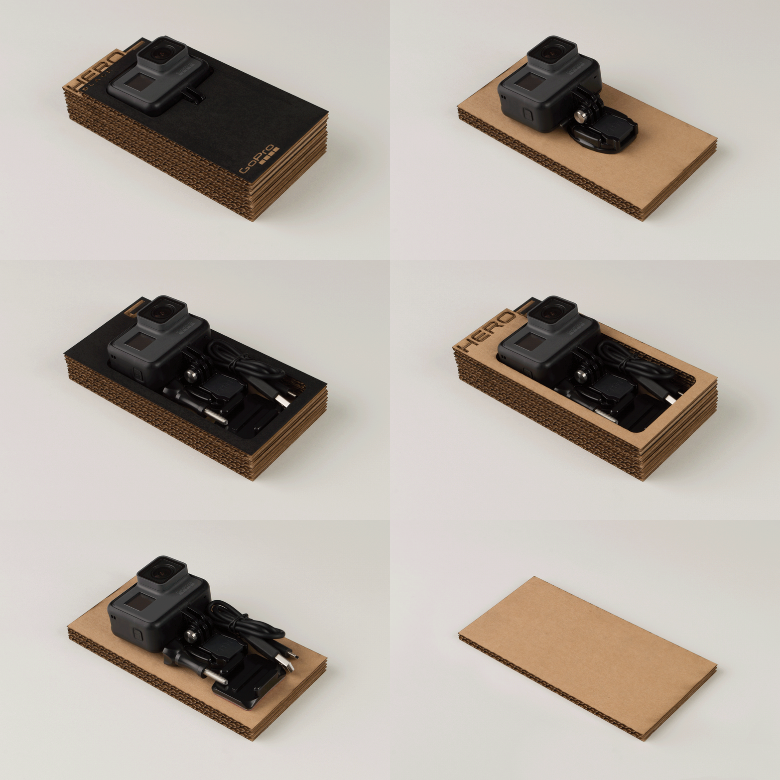
Tech, like Sneakers, is where you generally see a lot of interesting and innovative packaging options. From some crazy X-Box options to basic headphone packaging (that is nice), you seemingly always get something nice/neat.
It seems the unboxing experience has become such a large part of the product experience itself that brands in this space (sneakers as well) are creating really interesting concepts for both general release product as well limited edition or single number based projects (you tubers, influencers, etc).
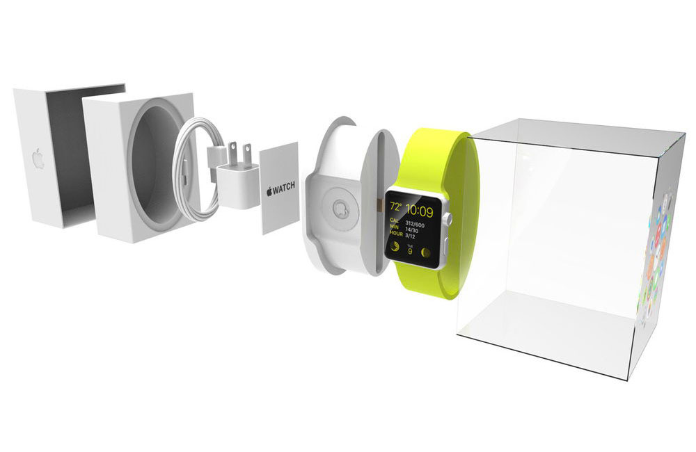
The student concept for Apple Watch packaging is a good example of balancing functionality, aesthetics and ensuring the packaging is useful after you’re done unpacking it all – which, in all honesty, should be the end goal with any packaging (hard I know, but a good goal).
Packaging Ideas - Environmental/Sustainable
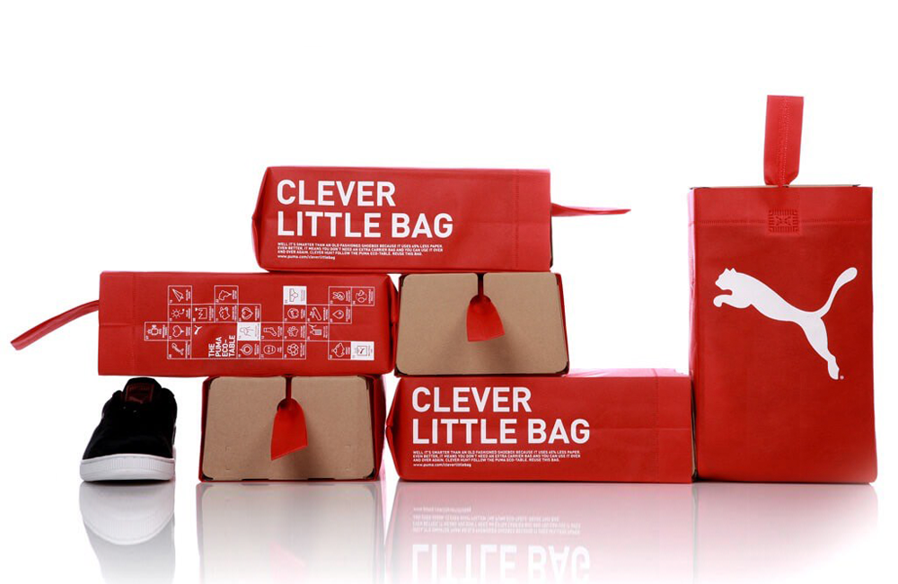
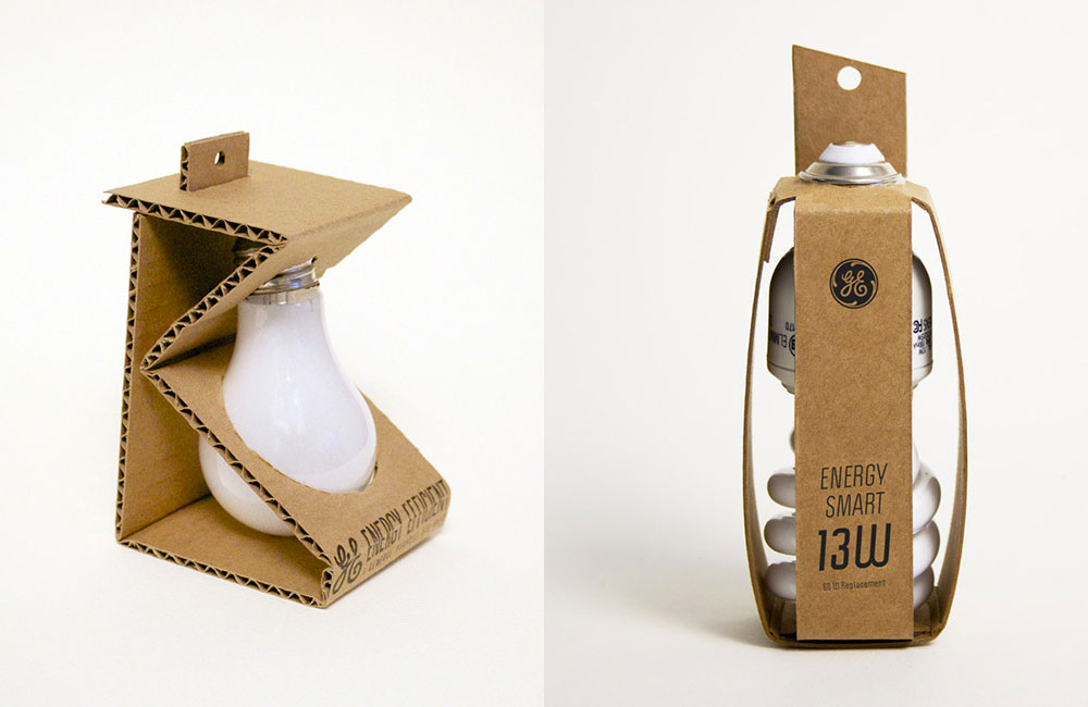
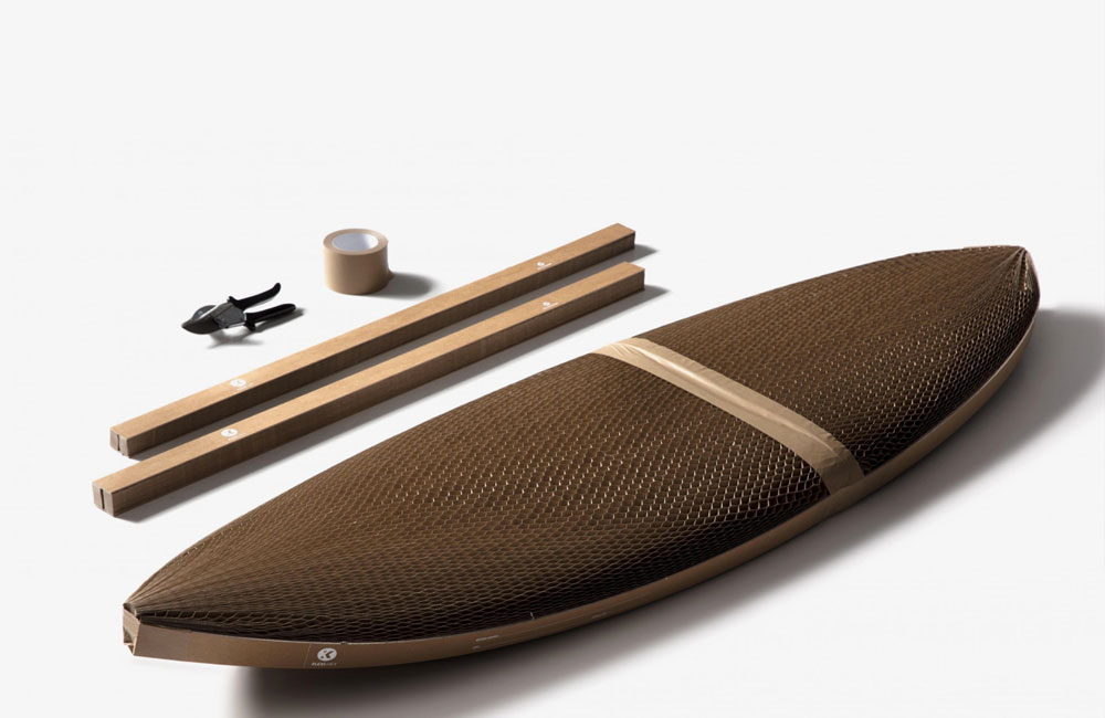
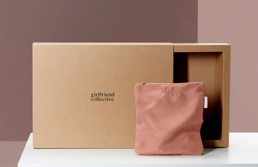
It’d be rude to do a packaging article like this and not include a section around environmental/sustainable packaging. Given the majority of what I included earlier is plastic, plastic derived or just straight up one-time use, it’s worth exploring options that are a little better for the environment. And to be completely honest, every brand should be pushing their packaging in this direction – both environmentally friendly and creating multi-use options where possible.
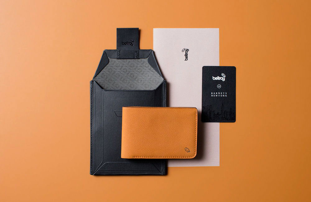
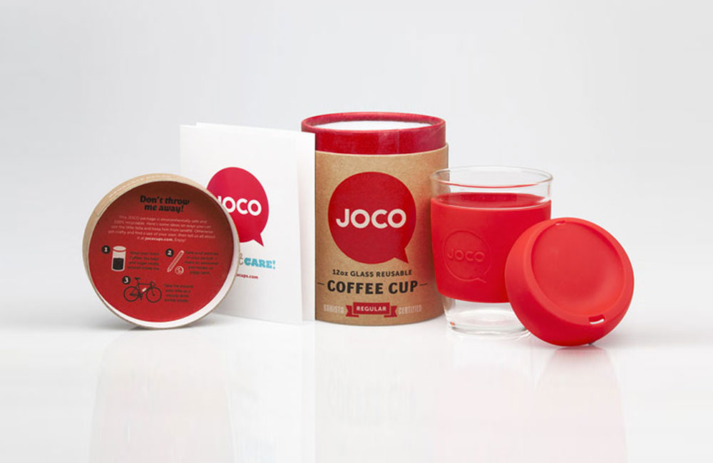
This galley isn’t exhaustive, nor inclusive of the best packaging out there. It’s a good gallery of some packaging that are heading in the right direction like Bellroy or Joco whose packaging is very much both made from environmental friendly materials, and also re-usable (you can re-send, use for receipts, etc with Bellroy packaging, and Joco’s allows you to store any number of things in there although I use it for pens).
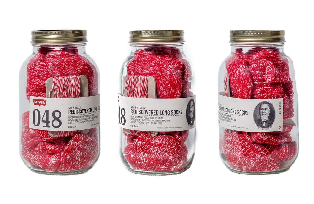
Levi’s also jumped in with, I think, a limited run of jars for their socks. Take the socks out and you have yourself a nice glass jar to use. Pretty neat.
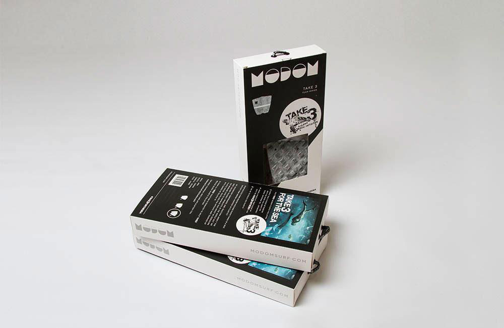
Modom is another brand doing well with card-based packaging, they’ve been using this concept since launch. It looks good in-store, allows access to the grip to touch and even decreases the foot-print it takes up. Kinda amazed it’s taken competing brands so long to catch up or at least move towards this area. O&E just launched a revised packaging program that is using a lot less plastic, just waiting for the other big boys to catch up…
Wrap-Up
I’m probably forgetting quite a few, so if you have examples of great (or good) packaging within surf, let me know. I do remember some great concepts from Hurley when they launched their first Phantom boardshorts and Quiksilver with their explosive? boardshorts (the compression ones). Even the Corey Wilson x Mick Fanning book, in the limited version, was quite nice.
Media seems to win, for the most part, in surf with packaging concepts. Sipping Jetstreams, Slow Dance (Craig Ando), Rip Curl Search Classics DVD Boxset (DVDs!!) are examples that all deliver either something interesting or simply classic. Sometimes you don’t have to make it wildly over-the-top, as simple generally always win.
Further Resources:
*The DieLine
*Lovely Package
*Packaging of the World
*Behance or Pinterest (be good at search)

